Hello!
I'm Kate, branding strategist, designer and craft enthusiast! I am passionate about helping small e-commerce business owner's dreams come true through design! Check out how I can help your online business succeed!
Learn More!
Create an Effective Call to Action on Website
July 5, 2021

Are you struggling with getting more people on your email list? Do the number of people that reach out to you through your website depress you? You’ve got people coming to your website, but getting people to follow what you want them to do is not happening. So, what can do you?? Let’s talk about how to create an effective CALL TO ACTION on your website to create more conversions TODAY.
Okay, first of all, let’s talk about a CALL TO ACTION. What is it? It’s a simple phrase of button that is used to tell your browsers what action to take. It can be small like “BUY NOW” or a little bit longer like “looking for your dream home? Sign up here for updates, so you never miss out”
This needs to be super clear on each page of your website. Do not let people get to a point of wanting to work with you and get confused as to what step to take next. Here are a few design tricks you can do implement quickly to get more conversions TODAY.
CHANGE THE COLOR
If your CTA is a button (contact me, buy now, sign up here, etc.), make sure it’s in a color that stands out. The best 3 colors for CIA buttons are red, green, orange or yellow. Red evokes excitement and urgency. Green brings up calm emotions and is often associated with the word “Go”. Like, GO contact me for more information! Orange and yellow give off the emotions of happiness and excitement. When people are getting happy vibes from you, they’re going to be more apt to do what you tell them to do.

CHANGE THE PLACEMENT
Did you know that the eye follows a pattern when viewing websites, signs, and pretty much everything. When you understand this pattern, you’ll be able to play along with it and understand how to get people doing what you want them to do.
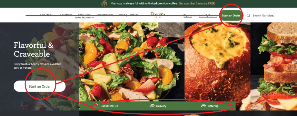
People view websites in a Z pattern, since that is how we read. Panera’s website is perfect example of this. They have a CTA at each point on the Z pattern.

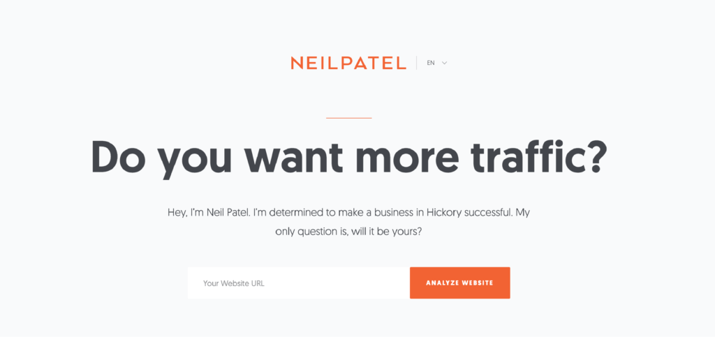
Utilizing white space in your website to push people towards your CTA, is a great idea. To do this, you want to effectively create blank space around where you want people to go. Neil Patel’s website is the perfect example of this. He goes a bit extreme in literally putting nothing else on the top of his page ‘above the fold’, thus giving zero doubt as to what the user should do next once they land on his page.

Putting your CTA, front and center on your website will also catch your user’s attention. People’s eyes will be drawn to the middle if you create an interest. Make sure you’re not cluttering around this (white space is key). I know absolutely no one knows Lenoir-Rhyne University, but I’ve got to give credit to my alma mater for utilizing their CTA front and center.

CREATE GRAPHICS AND/OR MOTION AROUND CTA
The use of motion and illustrations within your website is huge right now. Create anything that catches the user’s eyes is super important and can lead your audience in the right direction. Be careful not to get too crazy with this. We don’t want to annoy the user. Here are a few example of using subtle graphics and movement to attract the user to click.
Don’t wait another second losing people to a confusing website. Create an effective CALL TO ACTION on your website with these tips. If you’re looking at your website and confused at all as to what to do to create converting call to actions, contact me! I’d love to design a website that converts your viewers into buyers.
